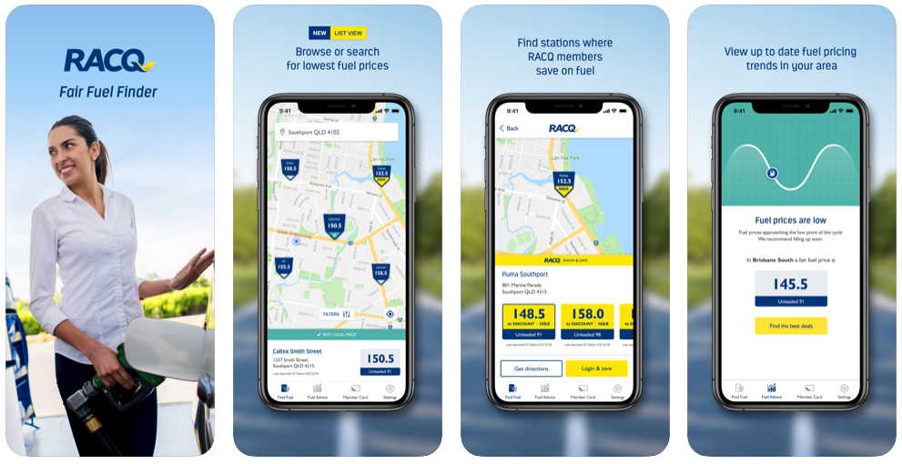
Fair Fuel Finder
Overview
In 2018, the QLD government introduced a mandatory fuel price reporting scheme. This meant that all fuel retailers had to report their fuel prices. This initiative enabled drivers to:
- Compare fuel prices at their selected location
- Find the lowest price
- Save money
This was an opportunity to step in and deliver a mobile experience that would enable motorists to find cheap fuel and get discounts quickly.
Role
Senior UX Designer
User Research, Visual Design, Ideation, Wireframing, Prototyping & Usability Testing
Challenge
Provide motorists with real-time information on fuel prices in their area and offer them discounts via a mobile app. As a result, attract more members and improve the online experience.
Solution
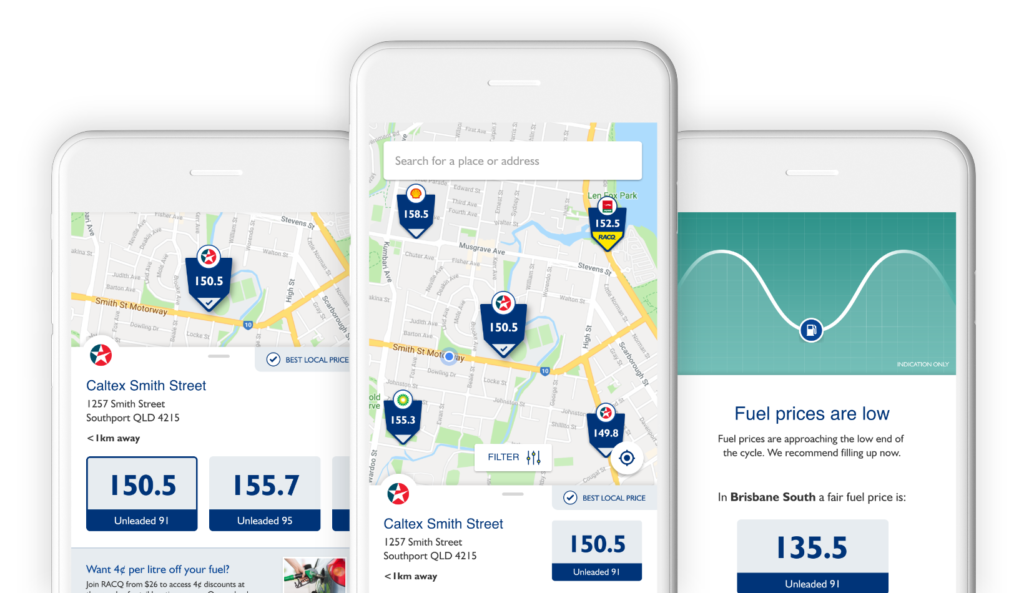
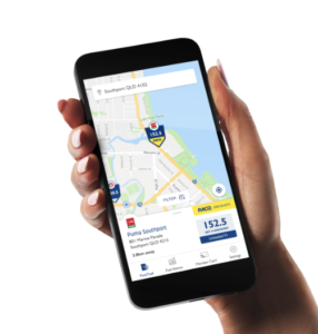
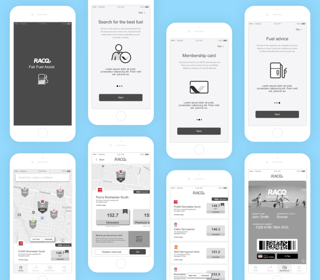
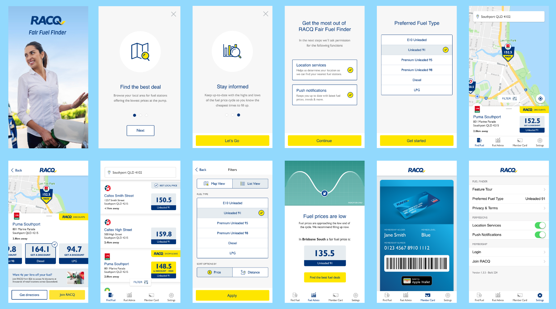
The solution proposed is a mobile application built on the Xamarin platform that allows users to quickly and easily find the cheapest fuel near them. Backed by an accurate and reliable live fuel data feed, users can get real-time advice on the best time and place to fuel up. RACQ members can also use the app to access their digital membership card and get discounts at participating fuel stations.
My design process typically includes the following activities on any given project
Stakeholder/User Interviews – Requirements Gathering – Competitive Research – Ideation Sessions – Sketching – Task Flow – User Flow – Wireframing – Prototyping – Usability Testing
Kick Off
We started with a series of discovery workshops with stakeholders to identify business requirements and user needs. These sessions gave us a solid foundation to start from, ensured that everybody was on the same page, and headed in the right direction.
Competitor Analysis
We scanned the market and collected successful and unsuccessful examples. This allowed us to find common patterns and features, learn from past experiences, and identify new opportunities to include in our designs.
Sketching the user journey
With the research completed, we identified our different users and sketched out two high-level journeys. This was a useful and quick method to get a holistic view of the whole journey and flag any high-level issues along the way. We held walkthrough sessions with the rest of the team for each iteration. These sessions were crucial in getting the designs right early in the process.
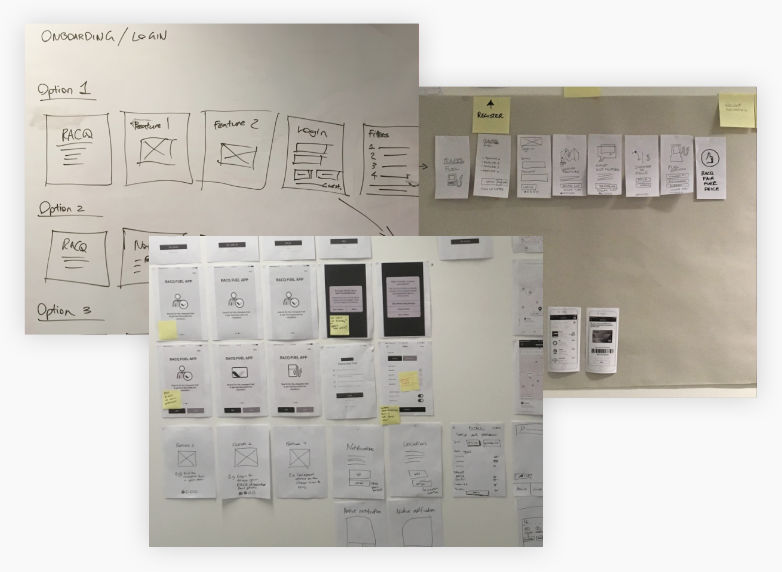
Wireframing
We translated the journeys and features into wireframes. At each iteration, we conducted a walkthrough session with the developers and stakeholders to address any issues.
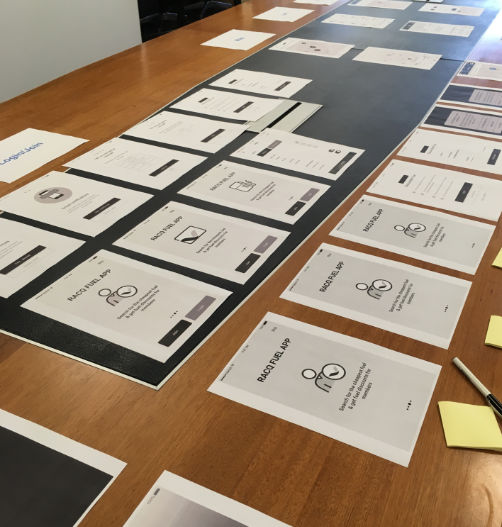
Prototype
Eager to find out how users would respond to the designs, we converted the wireframes into a low fidelity clickable prototype. We built the prototype using Sketch and InVisionapp and reviewed it together as a team before testing it with users.
Testing
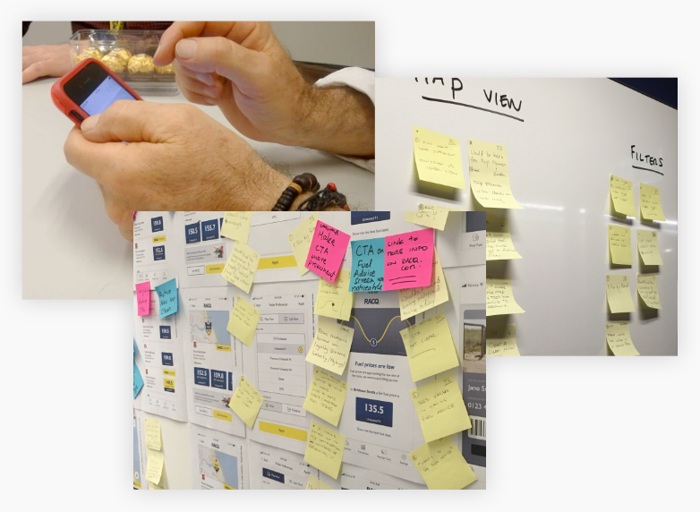
Before the official user testing, we conducted a quick guerilla test session with only five participants and refined our prototype.
We captured valuable feedback from our users at each round of user tests and iteratively addressed the issues raised.
We then presented our findings back to the business and proposed changes for the next design iteration.
Next Steps
After completing user testing, we handed the wireframes to the UI Designer, who made the whole experience come to life. In parallel, the developers started implementing the solution. As they progressed, we continuously held feedback sessions to refine gaps and issues.
Outcome
After a great team effort, we released the app on AppStore and Google Play. We were pleased with how the app was received.